How Roméo et Juliette Shapes Its Visual World: City Costume, Clan Colours and…
Roméo et Juliette is as much a visual argument as it is a musical and choreographic one. Across major productions, designers and companies use citywear, family palettes and a contrasting simplicity for the lovers' costume to build a stage world where social conflict and private tenderness coexist—and where visual choices underscore the ballet's sense of fatality.
Quick answer
Major productions repeatedly contrast elaborate civic and clan costumes—often colour-coded for Capulets and Montagues—with visually purer, simpler garments for Romeo and Juliet, using fabric and lighting to make those choices read consistently onstage.
What this article explains
- How colour-coding of families structures the stage visually.
- Why lovers’ costumes are treated as simpler to mark intimacy.
- How fabrics and lighting are coordinated so colour and texture behave predictably.
- Why these visual devices travel across choreographers and companies.
THE FIRST VISUAL WORLD OF THE BALLET
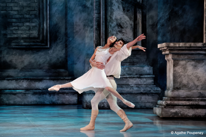
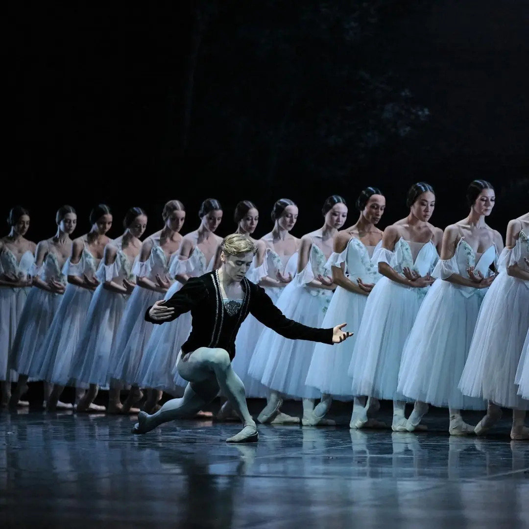
When an audience first sees Roméo et Juliette, the stage vocabulary is often civic: civic costumes, crowd dress and clearly legible group identities. Production notes and study guides for multiple companies identify sets, props and costumes as primary storytelling devices. That first impression—what the ballet looks like before any step is analysed—is therefore frequently a map of social structures rather than a portrait of the lovers alone.
COSTUME SILHOUETTES AND CHARACTER LANGUAGE
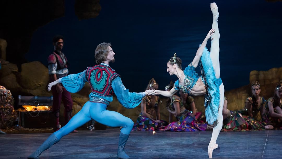
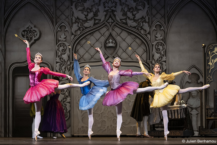
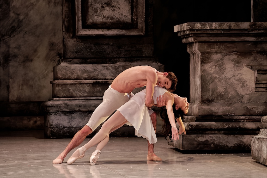
Across many stagings the language of costume signals hierarchy and role. Crowd and clan attire tends toward more elaborate silhouettes—period cues, uniforms, layered citywear—that read as communal identity. By contrast, Romeo and Juliet’s personal dress is intentionally simpler: a visual shorthand for youth, purity and emotional singularity. Designers have used silhouettes and period references to make these distinctions legible even from the house.
COLOUR, TEXTURE, AND ATMOSPHERE
One of the most consistent, documented devices is colour-coding. Major productions routinely assign distinct palettes to opposing families and social groups. Notably, Ezio Frigerio’s designs for Nureyev’s production (and later recreations) used colour as a battlefield of hatred, for example employing red for the Capulets and green for the Montagues. Other companies echo this structural device: complementary or opposing colours help the audience read alliances and tensions at a glance.
Designers deliberately coordinate fabrics and lighting so those colours and textures behave predictably under stage illumination. Production notes and interviews with costume teams describe supplying fabrics to lighting designers and choosing materials that convey weight, sheen or matte quality—small decisions that profoundly affect how colour registers in performance.
COSTUME AND MOVEMENT TOGETHER
Costume is not inert decoration; it moves with the body and changes the perception of choreography. Heavier civic garments restrain line and signal communal ritual, while simpler lovers’ costumes reveal the dancer’s anatomy and phrasing more clearly. That contrast makes pas de deux feel exposed and intimate by comparison: simpler fabrics avoid visual noise, allowing the choreography’s emotional logic to read without competition from elaborate accoutrements.
ICONIC IMAGES, SCENES, AND MEMORY
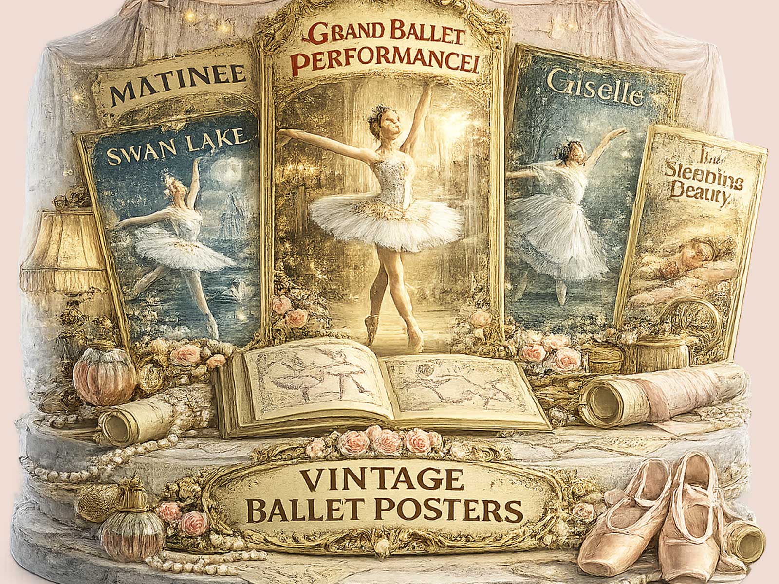
Because designers consistently deploy clan palettes against private simplicity, certain stage images become iconic. A ballroom awash in family colour inevitably frames the smallness of the lovers’ neutral or pure dress; a street fight composed of opposing hues turns choreographic violence into a tableaux of factional antagonism. These images outlive individual productions and make the ballet visually memorable in programmes, posters and wall art.
DIFFERENT PRODUCTIONS, DIFFERENT VISUAL READINGS
While the structural device—clan palette versus lovers’ simplicity—remains common, visual details shift between choreographers and companies. MacMillan, Cranko, Nureyev and contemporary reinterpretations each favour different period cues, fabric choices and silhouette emphases, but study guides and production notes show the same underlying dramaturgical logic: use costume to signal civic context, clan identity and the emotional contrast of intimate pas de deux.
DECORATIVE AND CULTURAL AFTERLIFE
That reproducible visual grammar explains why images from Roméo et Juliette translate so well into posters and decorative art. The binary of public colour and private purity simplifies into compelling graphic motifs: block colour families, a lone couple in neutral tones, the suggestion of impending doom through contrasting palettes. Because designers often coordinate fabric and light to achieve reliability, those motifs photograph and reproduce cleanly for publication and décor.
CLOSING INTERPRETATION
Costume in Roméo et Juliette does more than clothe bodies: it maps social worlds, clarifies dramatic stakes and makes intimacy legible against civic spectacle. The repeated use of clan colour-coding alongside visually purer lovers’ dress is a shared design strategy across major productions—one that shapes audience perception and lends the ballet its quietly inevitable tone.
Author: Cynthia D.